|
Recently I have been commissioned to design packaging for a Micro SD memory card. A logo and word mark had already been developed for the brand so I had to work within the confines of these already developed assets.
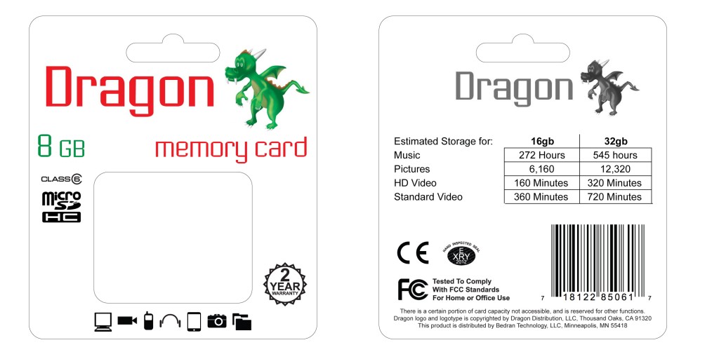
Initially the client wanted something that was more traditional and fit within a certain form factor so I created a quick mockup as seen in the image below.

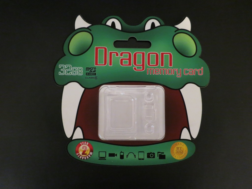
After seeing my mockup and becoming more comfortable with my design sensibilities my client was receptive to an alternative idea that I had which utilized the imagery of the Dragon more effectively.

In this iteration I maintained the color scheme of the brand along with the typeface. By altering the traditional rectangular packaging form I differentiated the product from others in the market by creating a unique and playful silhouette. There still are some revisions to be made to the package but I will be sure to post a final version once it has been completed.
Anthony R. Kling
|

