Unity
|
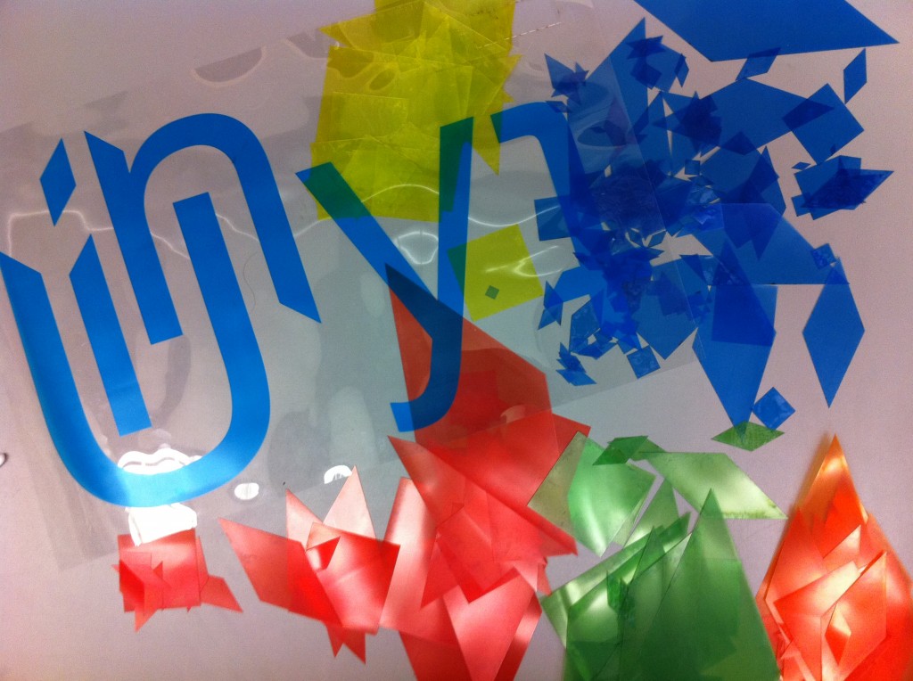
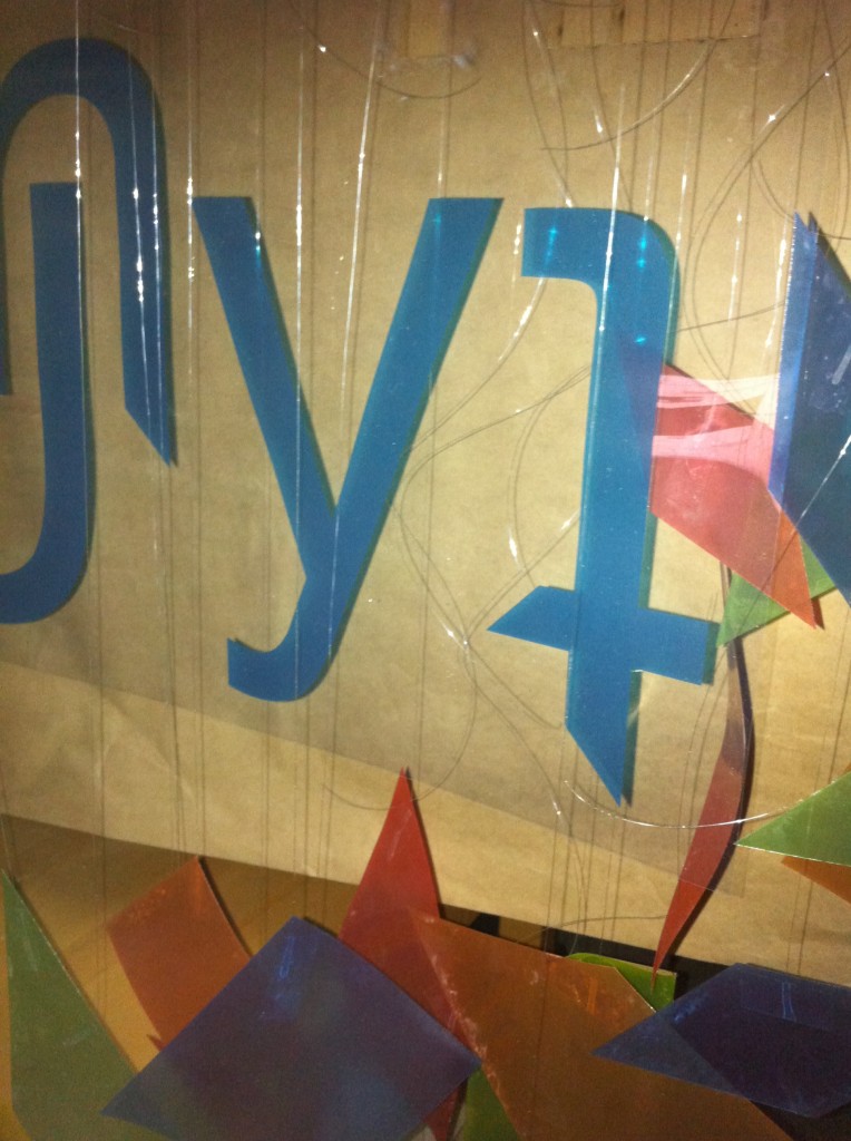
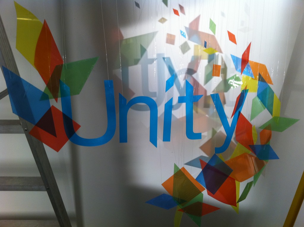
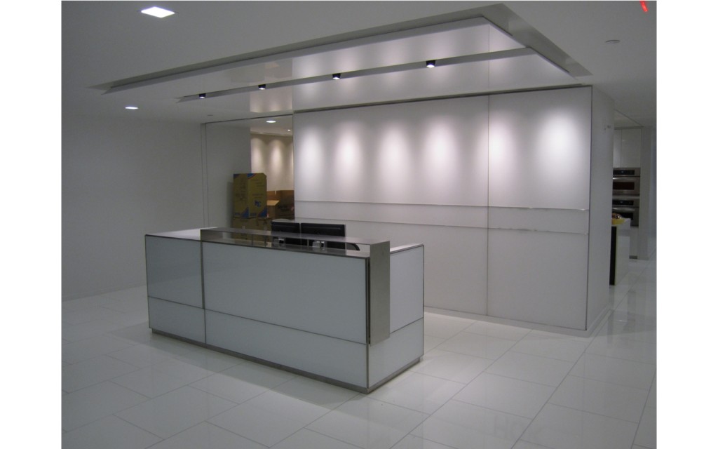
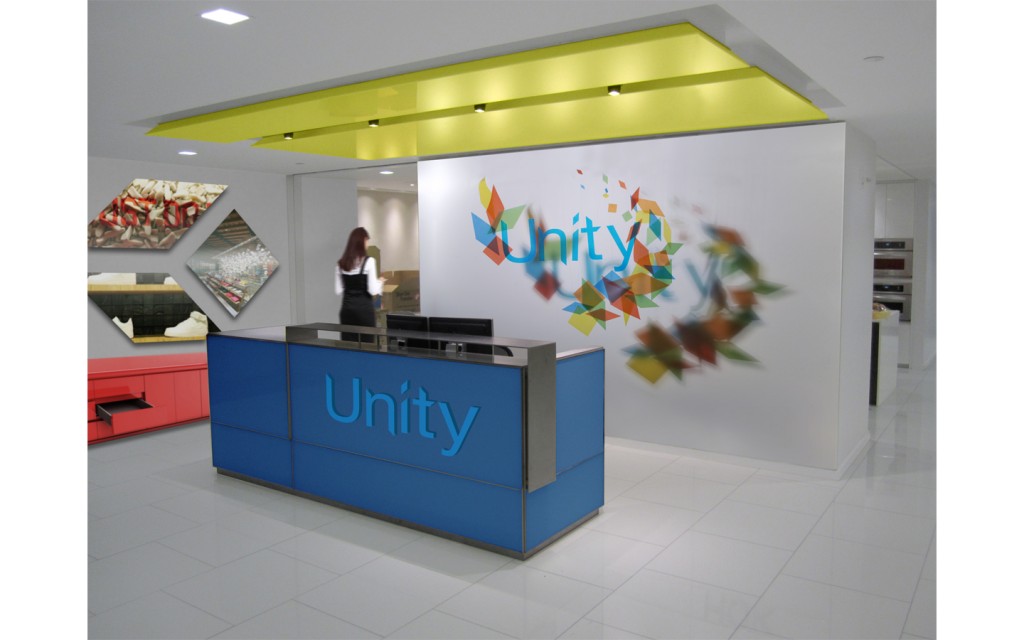
I thought it might be interesting to talk a little about how I fabricated part of one of the Unity pieces in my portfolio. In this project I was developing a fictional company and corresponding identity system. This company I named Unity and their mission was to design and brand interior spaces to deliver a cohesive and encapsulating visitor experience. Part of the way the brand conveyed this message was through the use of transparent colors and geometrical shapes arranged in such a way to convey a sense of depth. With this in mind I thought it would be great to create a physical model of what signage could look like for the office, behind the visitor’s desk, at Unity. To do this I decided to print different colors on transparencies and use the laser cutter to cut out the different geometrical elements and logotype. After cutting out the pieces I attached fishing line to the different elements and did a quick mockup of what the sign would look like for proof of concept. Once I had finished arranging all the elements I utilized a light to create a colored shadow further accentuating the sense of dimension the brand was meant to convey. I then photographed the piece against a white wall with several different lighting configurations and from several different angles. After this I found an image of an office that I thought would be appropriate for the reception area of Unity. From there I digitally manipulated the image and superimposed the sign I created along with other elements. Further illustrating how this fictional company could take an existing space and redesign it with a cohesive brand message in mind. |
